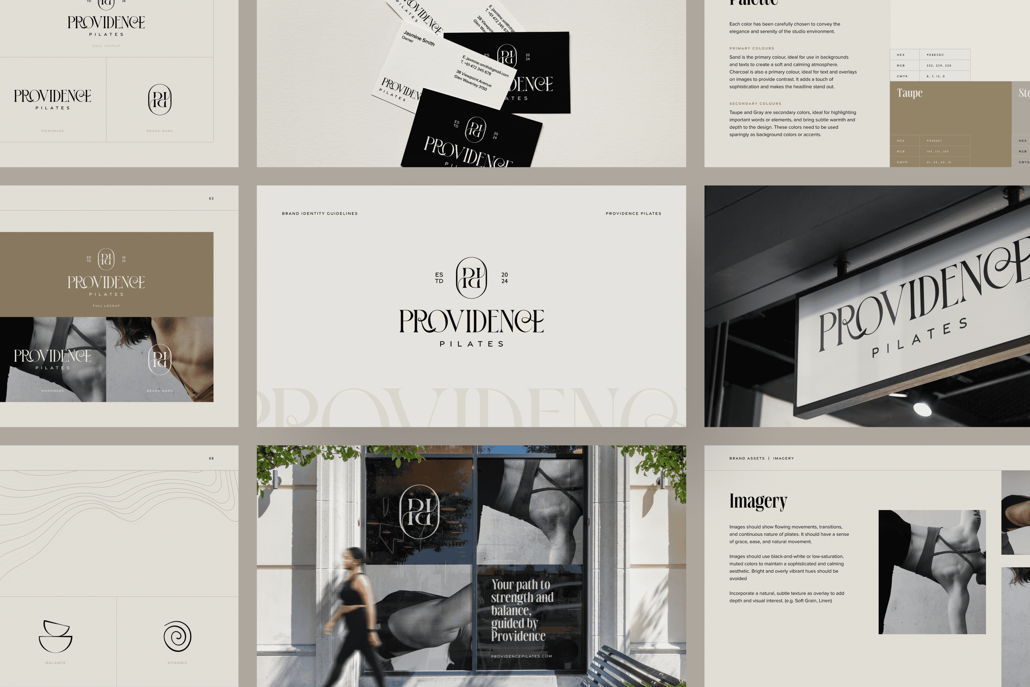
Providence Pilates
Designing a brand rooted in movement, mindfulness & modern femininity
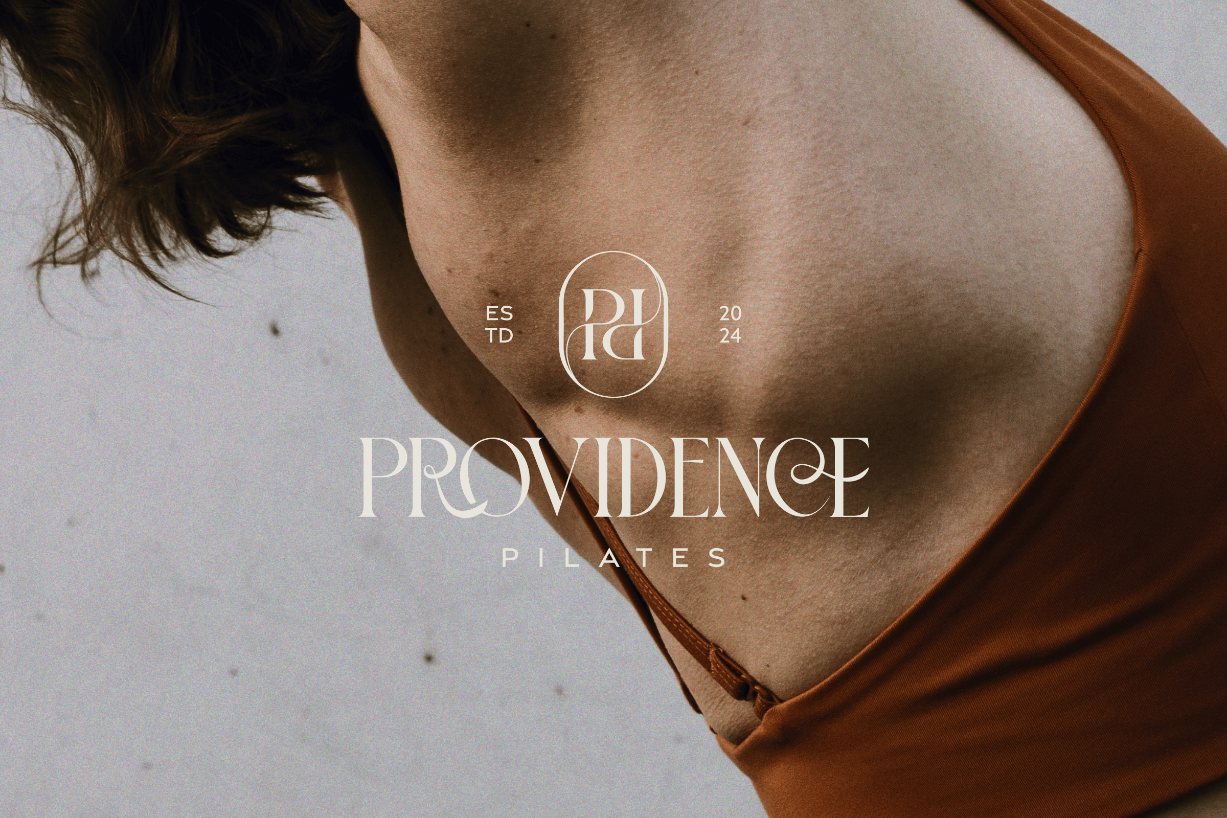
Providence Pilates is a local Pilates studio and coaching brand based in Australia. Built on the principles of grace, strength, and intention, the studio offers both movement and mindset alignment for modern women. I had the opportunity to lead the design, brand identity, and strategic direction of Providence Pilates from the ground up. The client wanted a brand that felt refined yet approachable, something that reflects the strength of the practice and the calm presence of the studio itself. This was a 7-day sprint project, where we met daily to walk through each design decision. Because of the clarity between both sides and the client’s openness, we completed the entire identity, including social media templates, within one week, with little to no need for major iterations.

The Challenge
The client wanted a brand identity that reflected the strength, grace, and intentionality of her practice, while positioning her studio as a high-end, modern space for personal transformation.
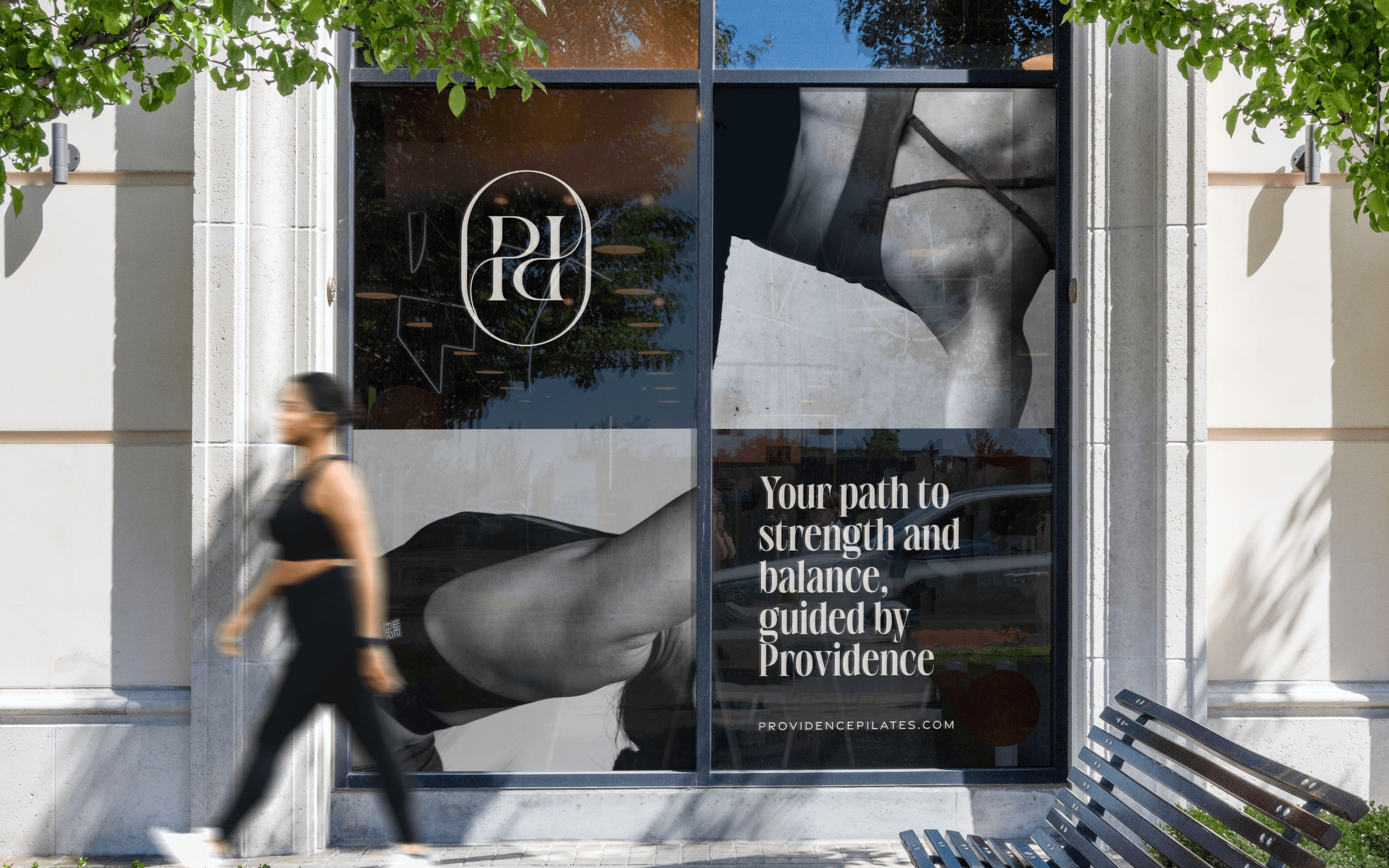
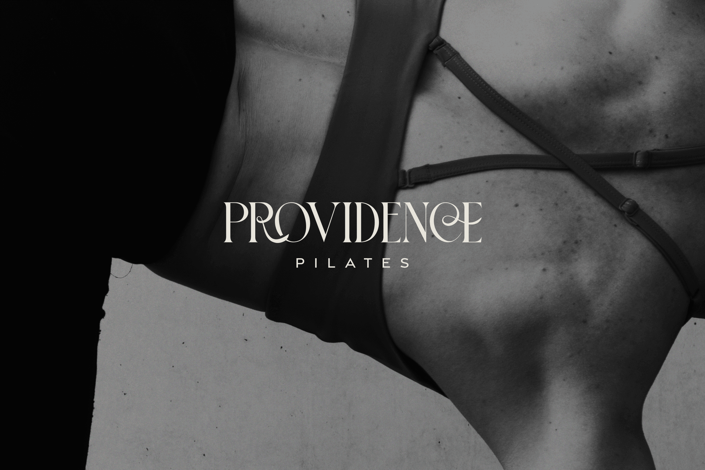
The real challenge? Designing something that felt elevated without falling into the cliché wellness tropes. We steered away from the overly soft, “zen and beige” aesthetic, and instead leaned into bold contrast, editorial typography, and refined imagery, creating a brand experience that’s as grounded and powerful as the movement it represents.
While there were no major blockers or creative struggles, the main constraint was the tight timeline, delivering a full visual identity in just one week. Thankfully, the client came in with a clear vision and full trust in the design process. That clarity created space for flow, allowing me to move with intention and efficiency from concept to completion.
My Approach
With a clear vision and trust from the client, I focused on building a brand system that felt both elevated and personal. The goal was to blend structure with softness, pairing confident, editorial typography with calming neutrals and thoughtful spacing.
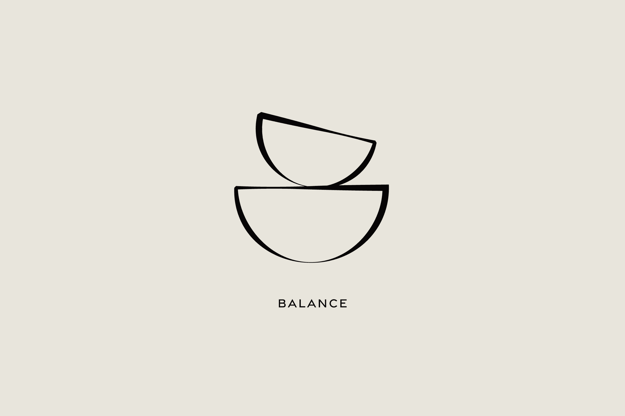
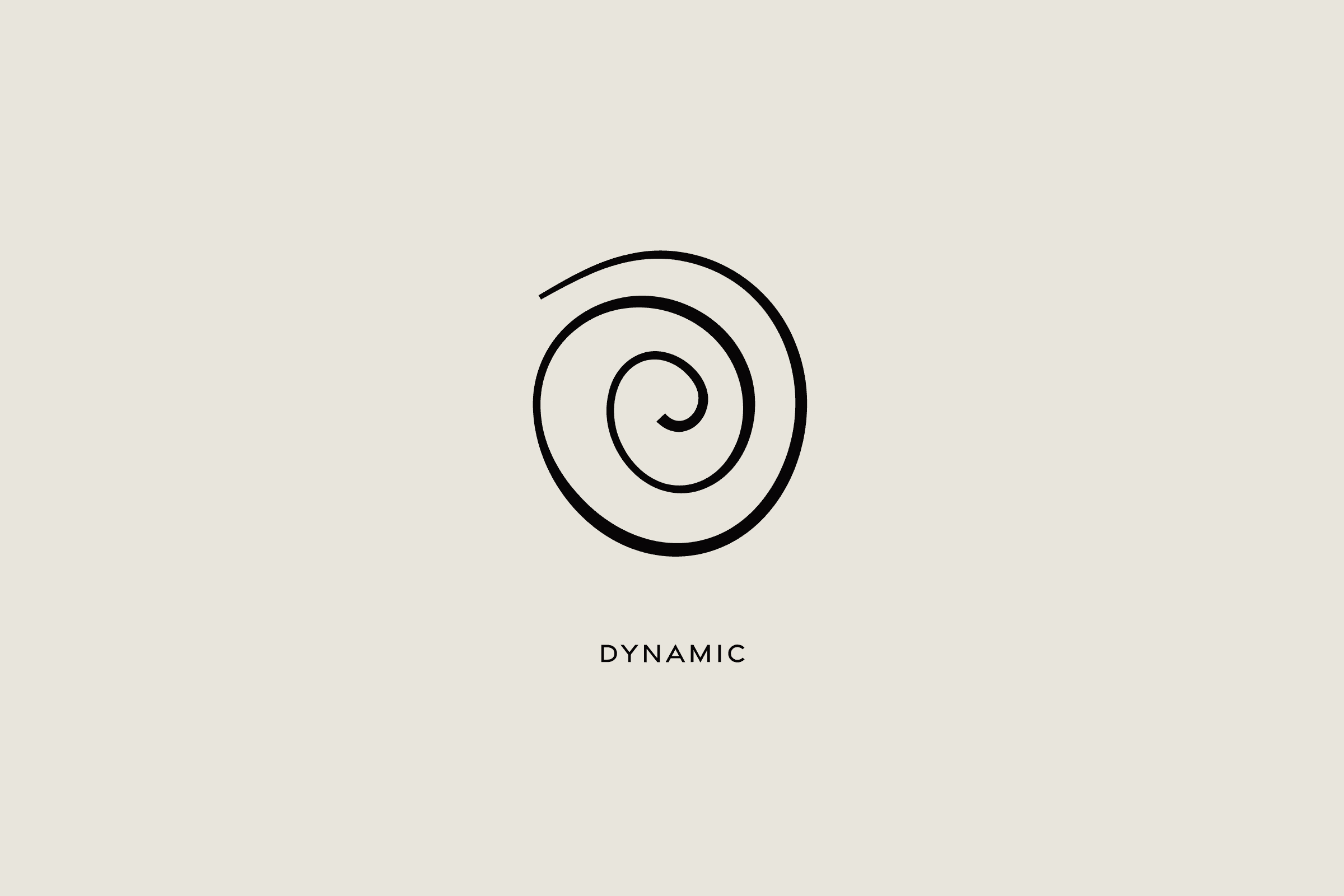
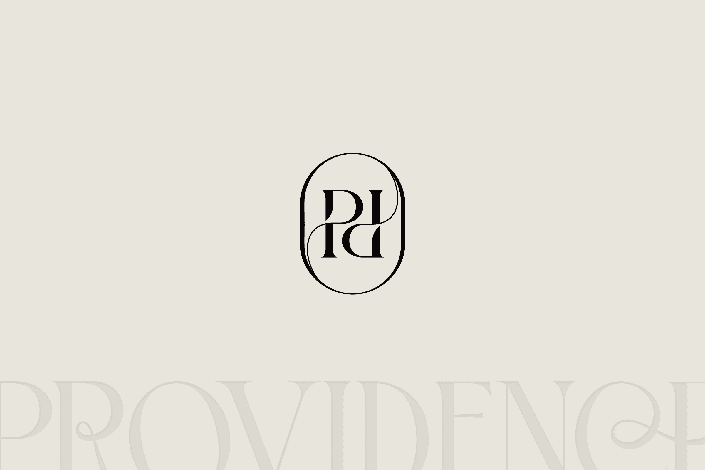
Every detail was intentional: from the custom “R”, "C", and "E" in the logotype, subtly evoking movement and flow, to the visual language built around balance, strength, and clarity. I designed the identity to feel calm yet confident, a visual reflection of the coaching experience itself.